
Living with Strong Colour
Strong colour is often misunderstood. It is treated as risk, as excess, as something that must be softened before it can belong in a refined interior. Yet in many of the most memorable rooms, colour is not the interruption. It is the anchor.
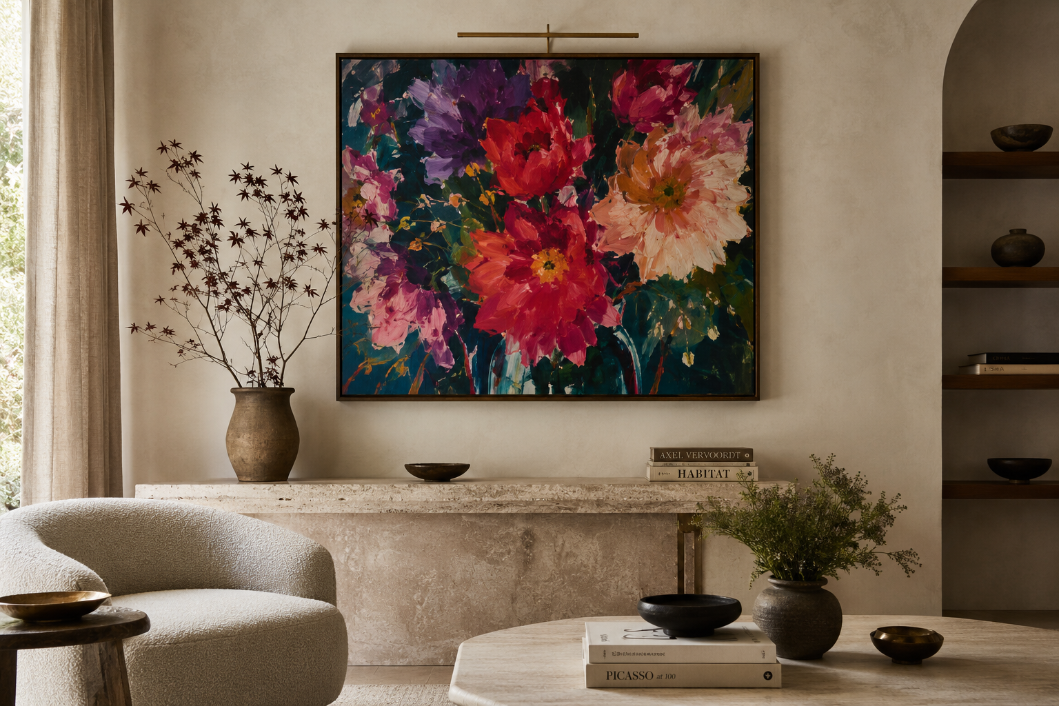
A vivid painting can do something that no accessory, fabric, or decorative object can quite achieve. It can give a room a centre of gravity. It can decide the emotional temperature of a space before anything else has been said.
The secret is not to use colour everywhere. The secret is to let one strong gesture matter.
Let Colour Have Space
When a painting carries intense colour, the room around it does not need to echo every shade. In fact, the most elegant approach is often the opposite. Warm plaster walls, soft stone, pale linen, walnut, travertine, brushed brass, and quiet upholstery can all create the kind of visual silence that allows a painting to breathe.
This is where strong colour becomes sophisticated. Not because it is diluted, but because it is given context. A red, cobalt, saffron, emerald, or fuchsia note can feel overwhelming when surrounded by too many decorative reactions. But against a calm architectural envelope, the same colour becomes intentional.
The eye understands hierarchy immediately. The painting leads. The room supports. Nothing feels accidental.
Allow One Piece to Lead
Many interiors feel unsettled not because they contain too much, but because nothing has been given permission to lead. The eye moves from object to object, searching for importance. A strong painting solves this immediately.
It creates a visual destination. Above a fireplace, behind a dining table, at the end of a hallway, or on the primary wall of a sitting room, a vivid work of art gives the space a point of arrival. Everything else can be quieter because the painting is doing the expressive work.
This is one of the reasons collectors and designers return to original artwork when building high-end interiors. A decisive painting does not simply decorate a wall. It organizes the room emotionally.
Use Neutrals as a Frame
The most effective neutral rooms are not blank. They are layered. Limewash, woven textures, honed stone, antique wood, parchment tones, and imperfect ceramics all bring depth without stealing attention from the artwork.
This matters when living with strong colour. A vivid painting needs contrast, but not harshness. It needs enough quiet around it to feel elevated, and enough material richness around it to feel at home.
In a luxury interior, colour should not feel added at the end. It should feel discovered within the space. The painting may be the boldest element, but it should still belong to the room’s palette, mood, and architecture.
Think Beyond Matching
Matching is rarely what makes a room memorable. A painting does not need to repeat the sofa, the rug, or the cushions. It needs to deepen the atmosphere of the room.
A painting with strong colour can make a formal room feel warmer, a minimalist room feel more human, or a traditional room feel more current. It can bring tension, softness, drama, or freshness. Its role is emotional before it is decorative.
At Govan & Ghio, this is part of what makes art so central to the home. A painting is not only an object to be placed after the furniture is selected. It can be the piece that teaches the room who it is.
Let the Room Evolve
The first impression of a vivid painting may be its colour. Over time, other qualities begin to emerge: the composition, the movement, the quiet areas, the brushwork, the way the piece changes in morning or evening light.
This is why original art rewards daily living. It does not reveal itself all at once. A strong painting may be chosen for its impact, but it remains in a home because it continues to offer nuance.
In the right room, bold colour does not exhaust the eye. It gives the eye somewhere beautiful to return.
Living with strong colour is less about bravery than clarity. Choose one piece with conviction. Give it room. Let the surrounding materials stay calm, tactile, and beautifully restrained.
A vivid painting does not need to overwhelm a space. It can steady it. It can bring warmth, focus, and a sense of life that no neutral room can create on its own.